Ellen Ahc Jewelry
e-commerce website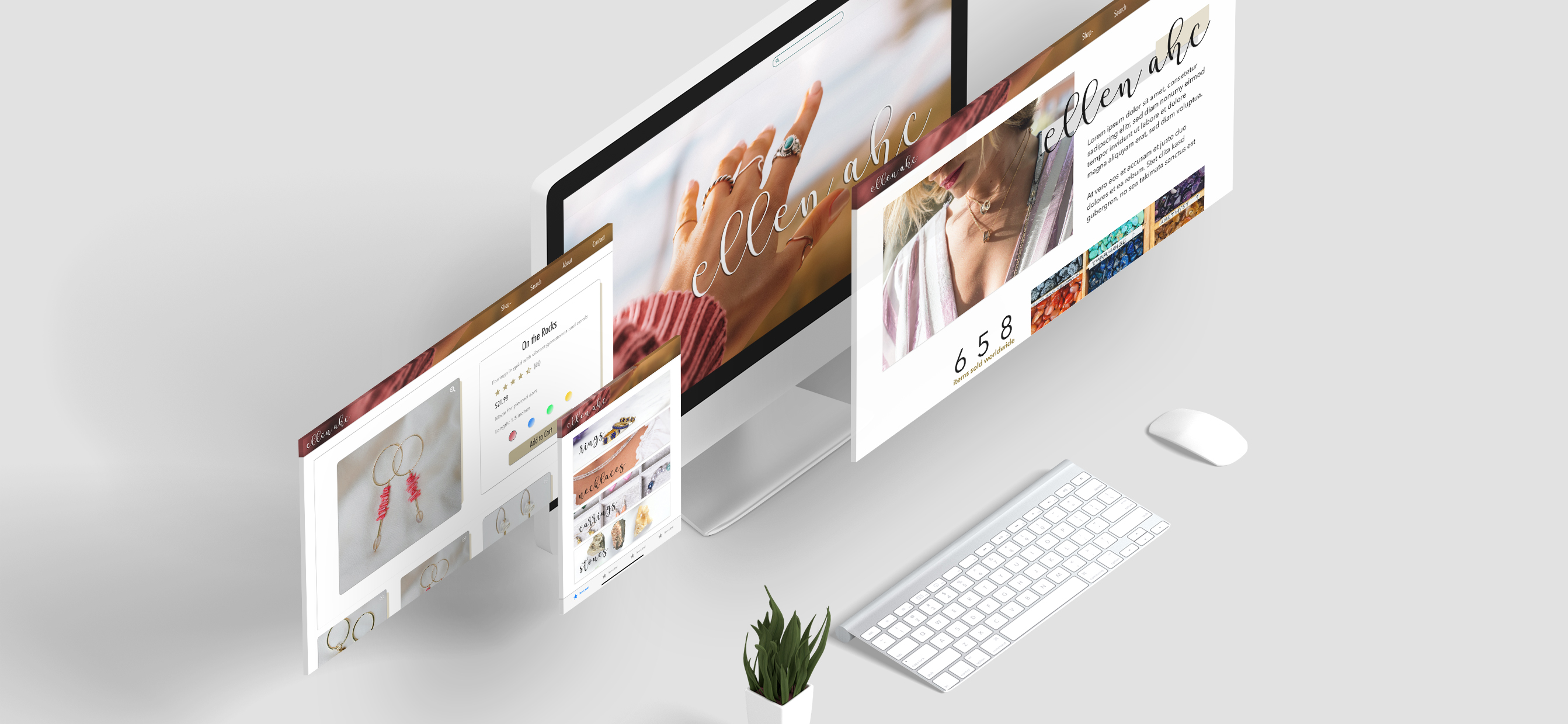
UI/UX Designer
Adobe XD, Adobe Photoshop
Dec. 2019 - Feb. 2020
Summary and Goals
After years of selling handmade jewelry on Etsy and Facebook, Chanelle Kay plans to rebrand as “Ellen Ahc” and begin selling her creations on her own e-commerce website in the second half of 2020.
Kay's goals were that the site achieve the following:
- appear simple but not boring
- focus on the jewelry
- attract advertisers
- have ads that are not distracting
- Team size: 1
- Target audience: 15-45 year-old women and girls
- Number of research participants: 6
- Research methods: Interviews, observational usability testing
Observations and Interviews
With the help of a browser extension and four online shoppers, I conducted desktop research, observing them as they browsed small and large e-Commerce websites.
This allowed me to see how they interact with comparable sites, what feels natural, comfortable, frustrating, and how long they spend on each page.
On most websites, users did not spend much time on the homepage, even if it had a lot of content (including deals) to scroll through. Users typically went immediately for the navigation bar for categories like shirts or necklaces or the search box for specific items.
I like having the option to search and sort by price. I rarely just browse everything, especially if it's a big store.
It's really useful to see real customer reviews and ratings.
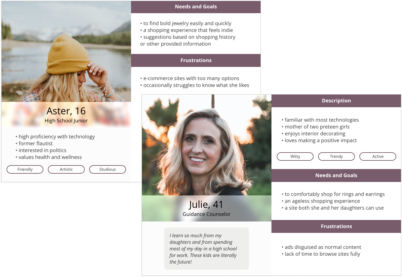
User Personas
Kay's client base spans a wide age range and appeals to a variety of people. Creating user personas based on descriptions from Kay helped me keep this demographic in mind.
Wireframes
Using Adobe XD, I created medium fidelity wireframes for usability testing and feedback.
Usability Testing and Design Solutions
A group consisting of Kay, three online shoppers, and a web developer was invited to click through the wireframes above and provide reactions and feedback.
From a developer standpoint, everything looks feasible to implement with the right budget or easy to simplify if needed. From a user perspective, the site looks clean.
Kay was pleased with the interactive elements, handling of ads, and overall "feel."
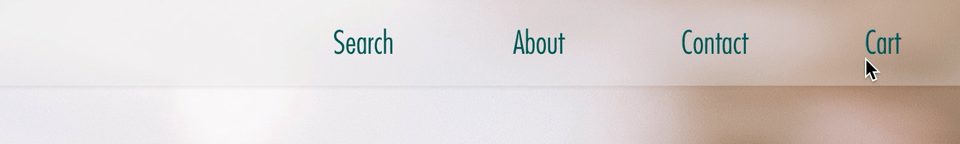
However, she wanted the navigation items to appear on one line and to all be represented by either icons or text — not a combination of the two. That is, the cart icon had to be replaced with text or the "about," "contact," etc. buttons had to be replaced with icons. Kay preferred the icons, but I advised her that they were less recognizable, to which she agreed.
To meet in the middle, I placed icons behind the text which animate on hover.
One shopper noted that in the wireframes, the search box — her go-to tool — was not reachable from the homepage and that some of her favorite sites allow users to customize product colors prior to clicking on the product's dedicated page. The final prototype includes both improvements, increasing convenience for users.
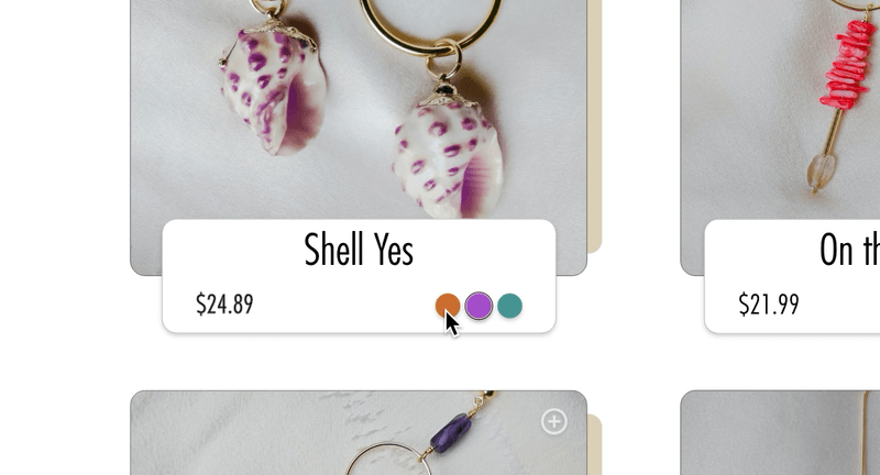
Customer reviews and the ability to zoom in on product images were also added to the product pages to help shoppers make more informed purchases.
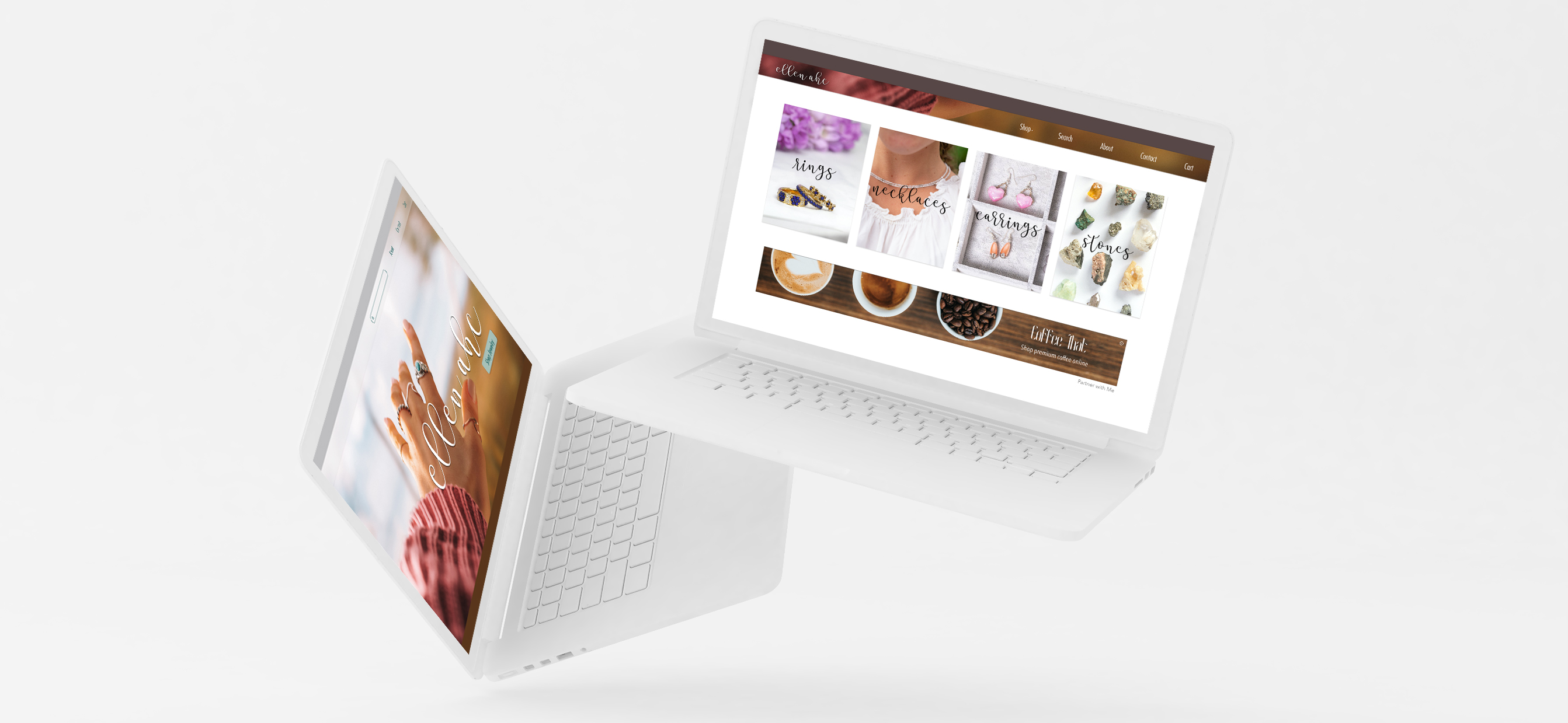
Final Prototype
Hover the video demo below for controls, including full-screen and pause.
Takeaways and Next Steps
This was my first freelance project and came with an extra degree of responsibility, as it will eventually be developed. Having a computer science background and being active in several design and development communities emphasized the value of design that is accessible and that can be realistically implemented.
This was important to me from start to finish and was an initial fear, as I never wanted to "play it too safe" out of concern for budget restraints or other potential development issues. Once, I began working on the design, it was easy to overcome this fear, remembering that features can always be modified if necessary, that less is often more, and Kay's vision of simple design.
Kay is in the process of finding advertisers and a web developer and plans to launch the site sometime in the second half of 2020.
Working with Tierra was awesome. She made me feel comfortable giving input, so everything felt collaborative. I was in the loop the whole time.
Because Kay's demographic and everyone I interviewed does most of their online shopping on a desktop, I aimed for responsive rather than mobile-first design. Next steps include creating mockups for mobile devices and tablets.